Share this

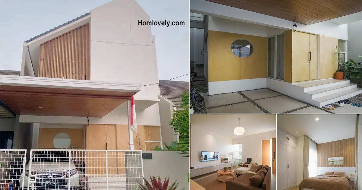
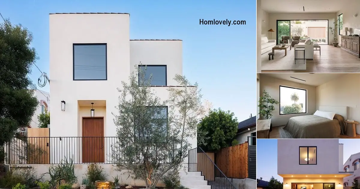
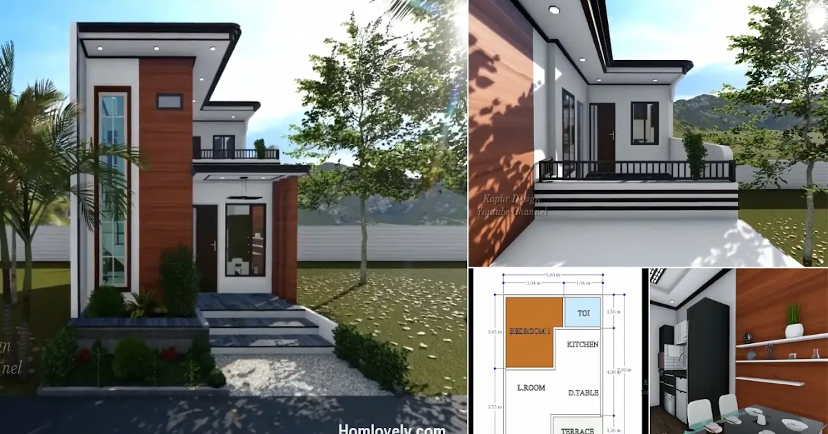
– Japandi style is a combination of Japanese and Scandinavian modern interior design. They are based on a minimalist design that focuses on warm, natural elements and muted color palettes. Japandi style doesn’t entertain ornate or gaudy details in your living room as interior design trends, only shiny shapes and lines. Here are examples of a 2-storey house design with a Japanese style that you can try and imitate.
Gray facade

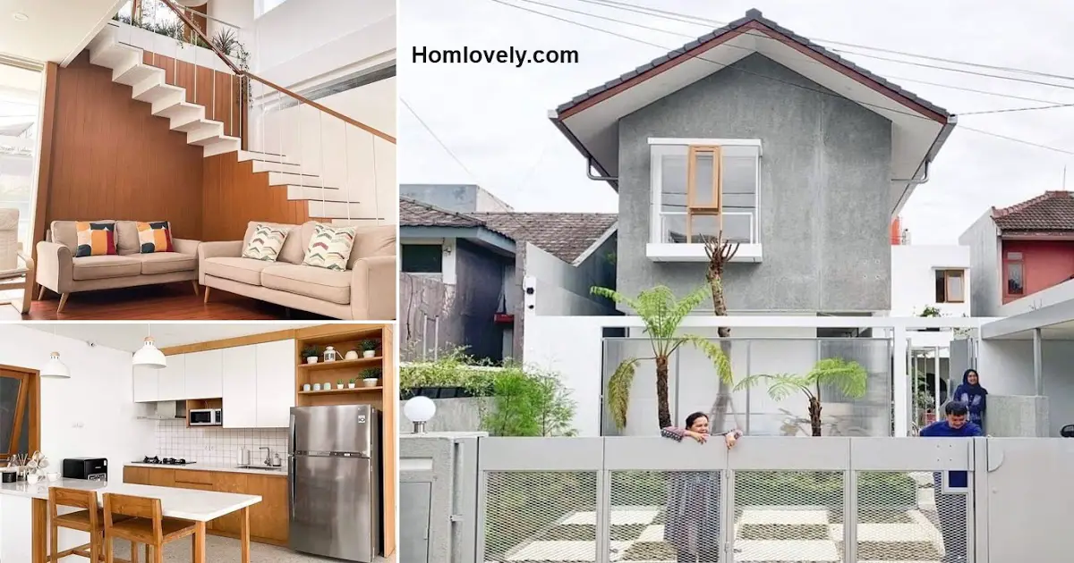
The appearance of the façade or exterior of this house looks simple. The dominance of the gray color of exposed cement, combined with the white color gives a fairly warm accent. Moreover, the design of green plants around the house also provides natural freshness and warm nuances.
Soothing swimming pool

A swimming pool in the area of the Japanese house makes the facilities more complete. The swimming pool-made in-ground design certainly does not provide accents that take up a lot of space. The exposed cement design in the relaxing area at the end of the pool gives a matching and natural impression.
Living room

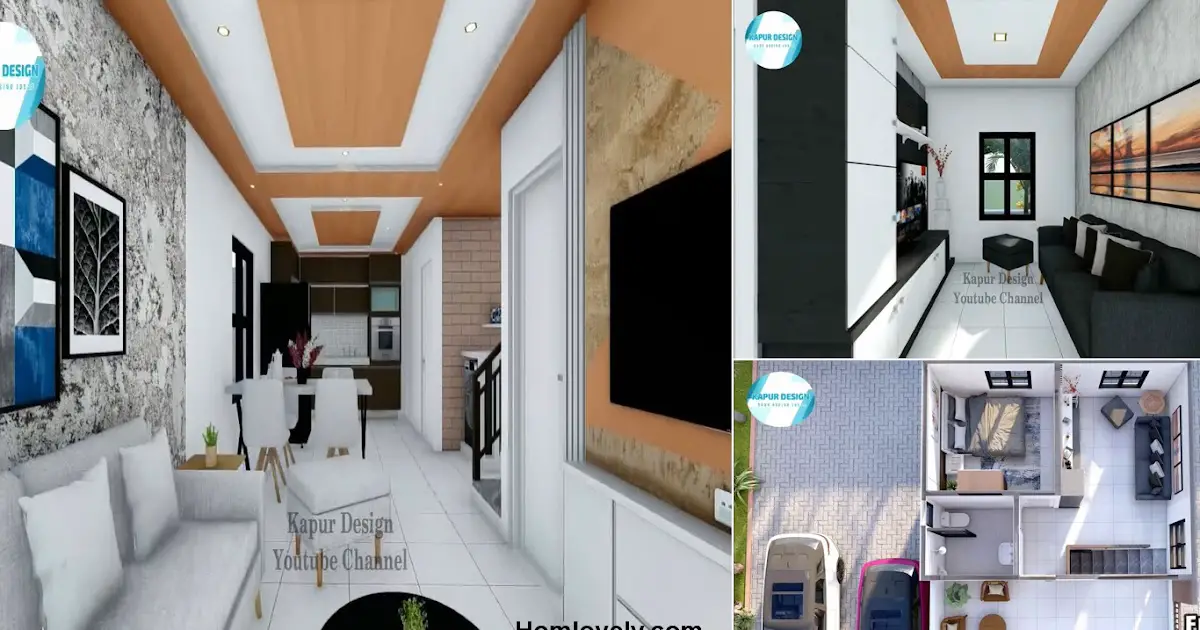
The combination of wood elements and white in the interior of the house also makes the atmosphere warmer and more comfortable. The living room located close to the stairs also looks neat with a neat arrangement. In addition to plain colors, you can add patterns to make the room more lively and not monotonous.
Kitchen area

The appearance of this kitchen also uses wood elements and white colors, colors that are typical for Japandi home designs. This inline kitchen is designed with shelves and cabinets to make it neater and more compact. The dining table that is the right size also makes the design in this room feel more comfortable and relieved.
Bathroom

The separation between wet and dry areas in the bathroom can make this area cleaner and neater. In addition, it can also help reduce moisture that causes the growth of mold. Wear a transparent sliding door or other baffle for this bathroom area according to your design and wishes.
Sink area

Located in the corner area, this sink has a minimalist yet functional design. Use the bottom of the sink as storage. The location of this corner is strategic because it is close to ventilation or air. Install additional lights in the sink area so that it is not too dark and gloomy.
Author : Yuniar
Editor : Munawaroh
Source : desainrumahku.idn
is a home decor inspiration resource showcasing architecture, landscaping, furniture design, interior styles, and DIY home improvement methods.
Visit everyday… Browse 1 million interior design photos, garden, plant, house plan, home decor, decorating ideas.
